
Create a Dashboard to View the Data
In this step, you'll use the Real Time Visualization section to build custom charts and graphs to easily monitor the virtual meter remotely.
To visualize the virtual meter's data stored at the Properties History section in AnythingDB, you will first need to create an App.
-
Click by following these
steps.
Note: The Application Client ID and Secret ID are required for configuring the Real time Visualization module. Be sure to capture and save this information.
Figure 1. 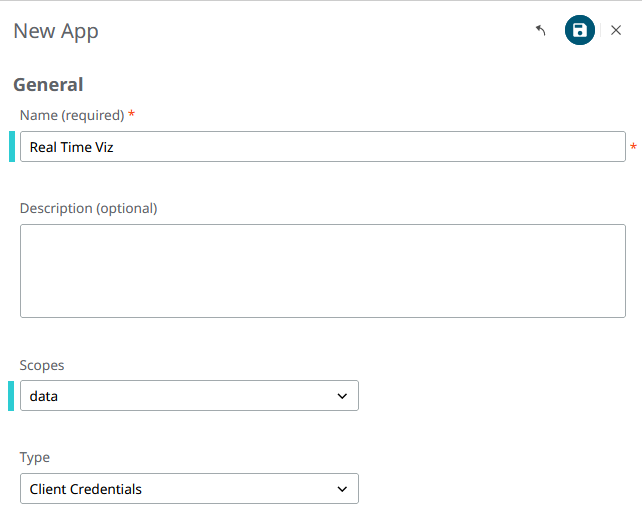
- From the left menu, click .
- Select the desired folder. By default, a root folder with your user name is already present.
-
Click New Workbook.
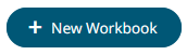
- Name the Workbook and click Create.
-
Create a Data Table by clicking the + icon. Data tables define the queries and
source data repository definitions in order to retrieve data.
Figure 2. 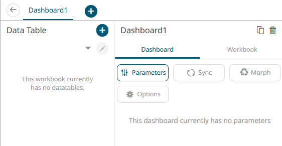
-
Under Data Table Settings, enter a title and click the check mark to save it.
Enter a description, if desired.
Figure 3. 
-
With Data Sources highlighted, under File/URL, select Altair IoT Studio.
Figure 4. 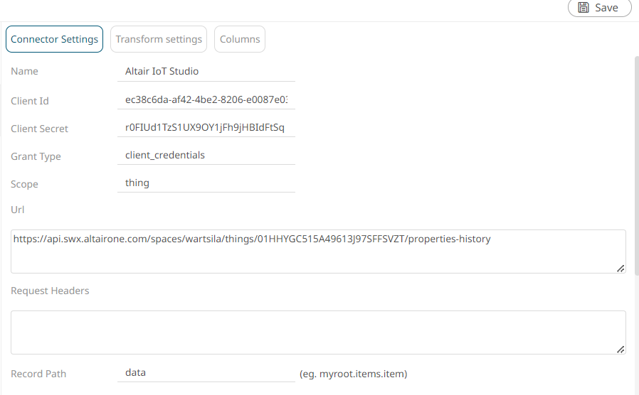
-
Enter the following:
- Client ID: from the app created in Step 1
- Client Secret: from the app created in Step 1
- Grant Type: type of app created in Step 1. Here we use client_credentials.
- Scope: Choose Thing to retrieve the data stored at the Raw History section
- URL: to make the request. Use
https://api.swx.altairone.com/spaces/YourSpaceID/things/YourSpaceUID/properties-history?source%5B%5D=ThingUID
Figure 5. 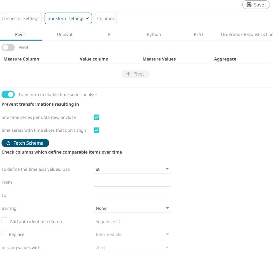
- Click Generate Columns.
- Click the Transform Settings tab and enable Time Series Analysis. Click Fetch and make sure the parameter at is set as the define time axis value. Update the barring to Auto to standardize sparse time series, which is especially common with sensor data, outputting values at defined time intervals, and potentially minimizing the number of rendered data points.
-
Click Refresh Preview.
The columns are populated and the requested data is displayed.
- Click Save.
- Click Back to return to the Edit Dashboard view.
-
On the blank canvas (right half section), sketch a simple square by clicking
and dragging on the blank interface.
This enables the Visualization menu.
Figure 6. 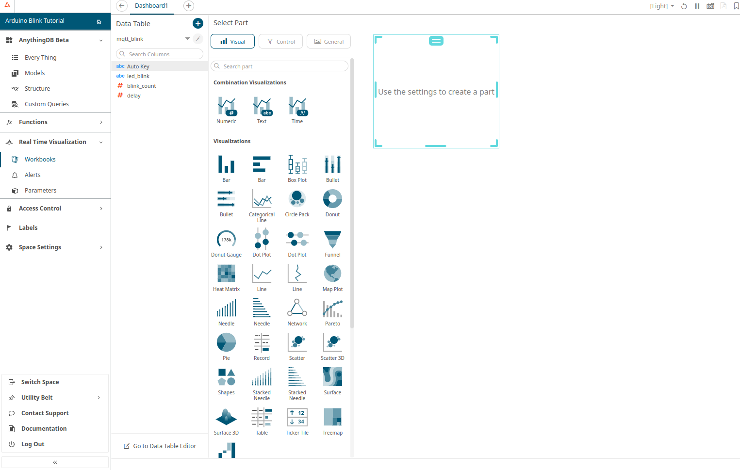
-
Select the Visualization mode (from the ones available at the Combination or
Time Series Visualizations) and configure it using the Visualization
settings.
For example, choose X-Axis Graph and configure it as follows by dragging and dropping the data elements to the different sections:
- Y:
- content.UD_DTYPE_KWH_ODM
- content.UD_DTYPE_KW_AV
- X
- Time
- Y: