Create a Dashboard Using the MQTT Connector
This connector enables you to retrieve the data stored in AnythingDB via MQTT.
- Click .
-
Select a folder to work in. By default a root folder with your username has
been created. Right click to see the different operations you can perform.
Figure 1. 
- Click New Workbook.
-
Enter a name for the Workbook and click Create.
Figure 2. 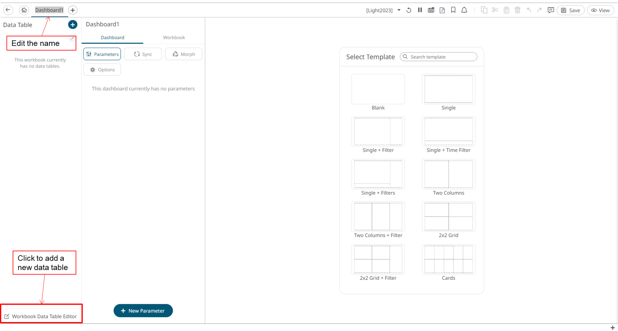
-
Add a new Data Table by clicking Workbook Data table
editor in the lower left corner.
Figure 3. 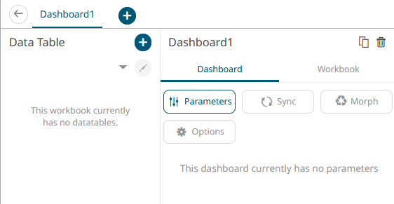
-
Create a Data Table by clicking the + icon.
Data tables define the queries and source data repository definitions, in order to retrieve data.
Figure 4. Add Data Table 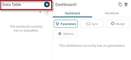
- With Data Sources highlighted, under Streaming, select MQTT.
-
Enter the following:
The information related to the MQTT settings can be found here.
- Name
- Broker URL: tcp://mqtt.swx.altairone.com:1883
- Topic: spaces/{Your Space name}/things/{ThingID}/properties-history/+
- User Id: From the Thing interfaces MQTT Username
- Password: From the Thing interfaces MQTT Password
-
Click Generate Columns.
Note: In order to generate columns, the data must be in delivery.
-
Select [Automatic Time Id] to add a timing column
relative to the Properties values.
Figure 5. Real time settings 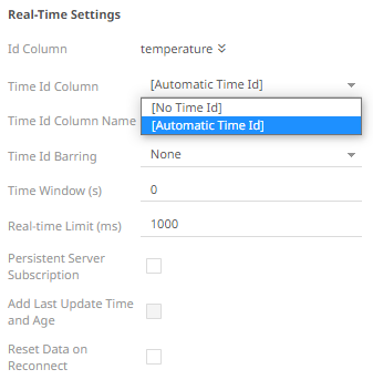 Note: You must click Start Preview to start previewing your data.
Figure 6. Data preview 
-
Enable Transform to enable time series analysis.
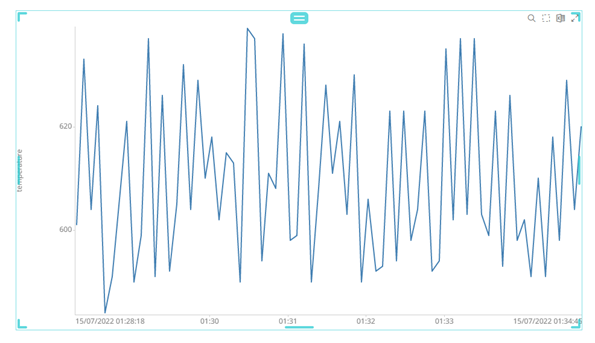
Figure 7. Transform settings 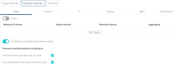 After enabling the time series analysis and clicking on Start preview, an oscillation ICON will appear.
Figure 8. Data preview 
- Click Save.
-
Click Back to return to the Edit Dashboard view.
Figure 9. Dashboard view 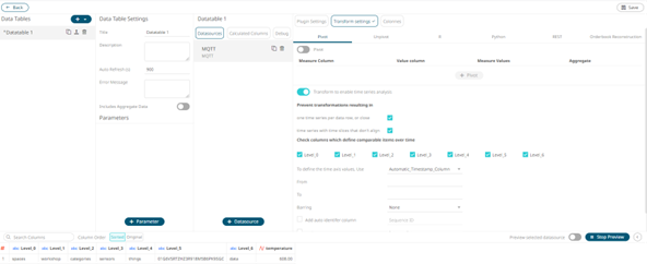
-
On the blank canvas (right half section), sketch a simple square by clicking
and dragging on the blank interface.
This enables the Visualization menu.
Figure 10. Visualization menu 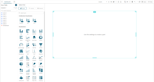
- Select the Visualization mode and configure it using the Visualization settings.
-
Drag and drop the property to the Y axis.
Figure 11. Drag and drop properties to the chosen axis 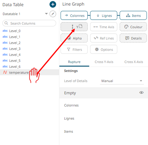
You will start visualizing the data received from your property.Figure 12.